Dev Stuff

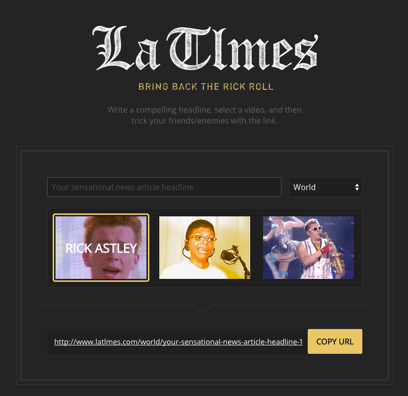
Jake and I just finished a little collaborative effort. For this little thing, he initially wanted a way to throw in a legitimate looking news article into a chat conversation but have it end up with sort of a “just kidding” type page.

To me, this seemed like a good time to bring back the Rick Roll.

We wanted to have the URL look as close to a legitimate news organization as possible, and considered things like “huff.post”, or “nytim.es”, but ended up with with the incredible latlmes.com, which we are pronouncing “Lah-Tillmes”.

Of everything in this silly project, the name is the thing I’m most proud of. A two pixel difference between it and a legitimate news organization’s URL? Amazing.

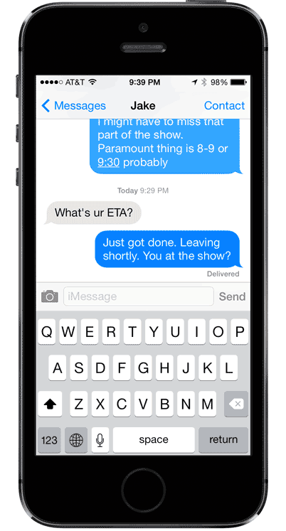
Because when receiving with a message from a friend like, “whoa, this is crazy” paired with long url like http://www.latlmes.com/culture/john-travolta-assassination-attempt-after-denouncing-scientology-1, are you really gonna notice that it’s a lowercase L instead of a lowercase I?

No. No, you are not.

Jake made the real nice design, and I did the development. Create a headline on the front page, and choose the video your target will end up being forced to watch: Rick Astley, Tay Zonday, or Epic Sax Guy.

Enjoy!

Site active
La Tlmes
Dev Stuff

I’ve been working on features for this website lately, one of which has been figuring out silly social sharing links. I’ve had a website long enough to remember the days of building a comment system in Perl, having a hit counter, and that being good enough.

Now you need to have all sorts of crap on a page in order to make sharing as easy as possible. One option is to piecemeal all the different networks together, but that requires giving up some control of your aesthetic, which I am not a fan of.

I hereby agree to have my site polluted with social sharing buttons in exchange for increased chances of going viral

Or you use a plugin like AddThis, which makes all that easier, maintains some control of your aesthetic, and also allows the people on your site a comical number of options for sharing.

Still use Livejournal? YOU ARE IN LUCK.

Read the rest of this
Ruby Gem stale
Popularity Gem
Dev Stuff

We’ve all got those websites that seem to sap away our time. For me, it’s Facebook, Reddit, and Hacker News. For others, it’s Twitter, or ESPN.

I realized that given a free moment while working—like waiting for a file to download, or an app to start up—my muscle memory will kick in and I’ll command-T open a new tab in Chrome and start typing f-a-c or r-e-d-d. And before you know it, my productivity is getting chewed up by an endless stream of gifs, AMAs, and ice bucket challenge videos.

Read the rest of this
Browser Plugin stale
Garlic
Dev Stuff

You use multiple passwords, right? Do some of your passwords just vary by the last character? Probably. reallylongpassword and reallylongpassword1, maybe.

In the clip below, I try logging into Instagram, using the first incorrect password, followed by the second variation.

See what happened there? The first password was wrong, so I thought I’d just edit it and add a 1 to the end of it, but when I tried to do that it cleared the field. This seems to be the norm in iOS apps, and it provides for a less than ideal experience.

There are two correct options, here.

  1. After entering an invalid password, clear and focus the field. This makes it obvious to the user that they have to retype their password.
  2. After entering an invalid password, don’t clear the field, but allow editing of the field’s contents. To avoid other mediocre experiences, you should also have a clear button on the right side of the input.

What you should definitely not do is make it seem like the field is editable by keeping the contents in there, and then clear it when the user tries to type in it. That’s just rude.

Dev Stuff

We all had tried our fair share of todo list apps, and none of them quite did the job. A friend of mine swore highly of his very low-tech system: write down the next three things he was going to accomplish, immediately followed by doing them. In a world of overly complex productivity solutions, this worked surprisingly well.

We started talking about creating a web-app that would better mimic this simple approach, called “Daily Goals”.

Common Problems With Todo Software

  1. People tend to put too much on their lists, leaving many tasks unfinished at the end of the day.
  2. Most Todo list software is either boring, overly-complex, or too open ended. We felt that with the right UI and right messaging, things could be made much better.

How Daily Goals Would Be Different

  1. Focus all messaging on what could be done today.
  2. Make our UI stand out, by not taking the typical approach to the problem.
  3. Don’t allow more than 3-5 incomplete tasks on the list at a time.
  4. Don’t automatically carry over unfinished tasks from the previous day.

Design Principles

  1. Simple things should be simple, and complex things shouldn’t be too hard.
  2. Talk to your users like they’re humans. Light, playful messaging is key.

“Boring software is broken software.”

Read the rest of this
Dev Stuff

It would be really nice if Messages knew about the people I had on Find My Friends. Right now there’s a disconnect that really doesn’t need to be there.

It works. It’s fine. But you know what would be better? Something like this:

Read the rest of this
Dev Stuff

When it’s so easy to pick five frames and try them on, it sure would be helpful to know which I’ve tried before and which I haven’t.

And it’d be so easy, too. They know my order history, and I’m logged in. Why not something like this?

“You ordered the Woodland Tortise color in Februrary 2014 and returned them.”

Dev Stuff

The KUTX mobile experience was in a sorry state. It’s so bare-bones, it doesn’t even feel minimal; it feels broken. After a friend pointed out that the iPhone app was built using Cordova and Angular, and how easy it was to extract that source code from the .ipa file, I got to work. With KUTX’s first birthday coming up just around the corner, I figured a much improved iPhone app would be a great birthday gift.

Old app on the left, new app on the right, obviously.

Read the rest of this
Dev Stuff

At Spiceworks, we really wanted to stop supporting older versions of IE, but understood from the stats we collected that 5-10% of our users were still on old versions. So we came up with an upgrade strategy.

Whenever you’re asking someone to do something that might be a little unpleasant, it helps if you make it enjoyable, or funny. That’s basic User Experience. Take their mind off the bad part— “You want me to what?”—by distracting them with laughs.

So catering to an audience of IT guys, I thought making an Office Space joke would be appropriate.

And apparently it worked, because it just made it to the front page of reddit today!

Dev Stuff

I made this for fun while I had mono. (Yes, Mono. At 31.)

It seems easy—just rotate those panels, right? Except they’re half panels. We’re making numbers fold in half, here, and it’s not that simple.