Long ago I wrote an open source ember addon for New York Public Radio called ember-hifi that powered their web audio applications, like wnyc.org, wqxr.org, newsounds.org, wnycstudios.org. It was used and maintained consistently for years and years, and as ember evolved it lagged behind a bit. So I started a branch to bring it up to modern Ember standards, and really started thinking about it from the outside in, to try and lower the learning curve.
I find it tremendously useful to start with a interactive documentation site when building something like this, as the usability problems are easy to spot early. And building this one was no different. Naming things is the hardest part, and that stuff really jumps out at you when you’re trying to explain how to use it to someone else.
After all the updates I did to the project, the changes got too big to feasibly do a mega-pull request to NYPR as their apps were still running legacy version of Ember and couldn’t benefit anyhow. So I did a hard fork, renamed it and launched it.
Back in those quaint times when it seemed like there was no way Texas would re-elect everyone’s favorite Senator, Ted Cruz, I woke up one morning with the url “cruzclues” in my head. Remarkably nobody else had thought of this, so I snagged the domain and then created a site to fit.
Thankfully there hasn’t been a shortage of meme content since he secured that senate seat for another term.
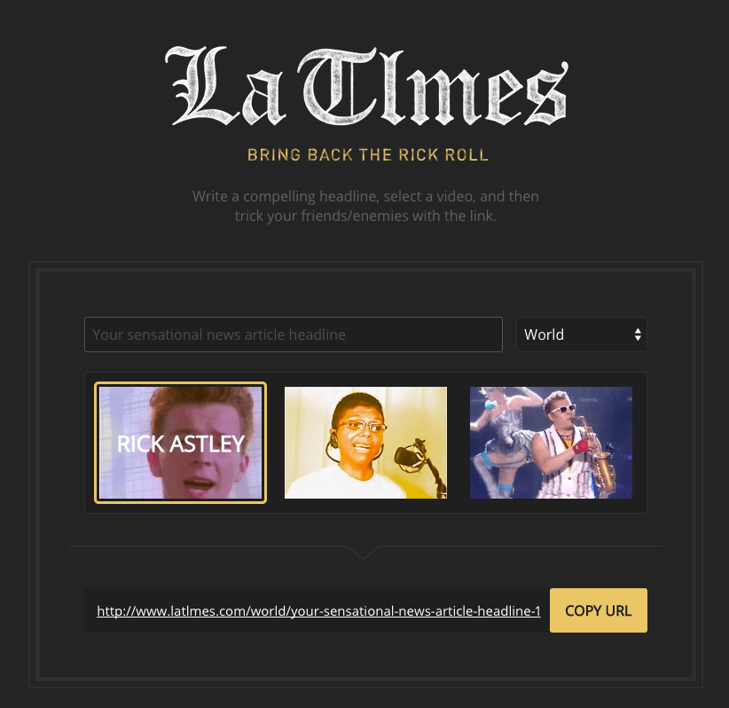
Jake and I just finished a little collaborative effort. For this little thing, he initially wanted a way to throw in a legitimate looking news article into a chat conversation but have it end up with sort of a “just kidding” type page.
To me, this seemed like a good time to bring back the Rick Roll.
We wanted to have the URL look as close to a legitimate news organization as possible, and considered things like “huff.post”, or “nytim.es”, but ended up with with the incredible latlmes.com, which we are pronouncing “Lah-Tillmes”.
Of everything in this silly project, the name is the thing I’m most proud of. A two pixel difference between it and a legitimate news organization’s URL? Amazing.
Jake made the real nice design, and I did the development. Create a headline on the front page, and choose the video your target will end up being forced to watch: Rick Astley, Tay Zonday, or Epic Sax Guy.
I’ve been working on features for this website lately, one of which has been figuring out silly social sharing links. I’ve had a website long enough to remember the days of building a comment system in Perl, having a hit counter, and that being good enough.
Now you need to have all sorts of crap on a page in order to make sharing as easy as possible. One option is to piecemeal all the different networks together, but that requires giving up some control of your aesthetic, which I am not a fan of.
I hereby agree to have my site polluted with social sharing buttons in exchange for increased chances of going viral
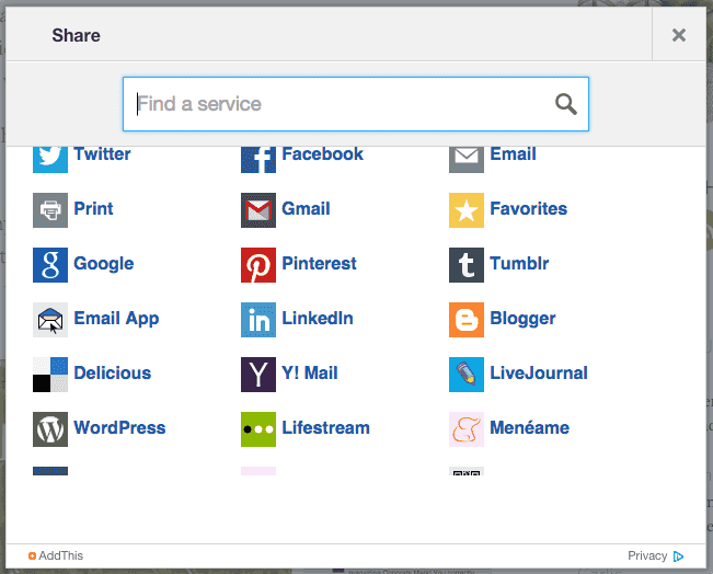
Or you use a plugin like AddThis, which makes all that easier, maintains some control of your aesthetic, and also allows the people on your site a comical number of options for sharing.
Still use Livejournal? YOU ARE IN LUCK.
Personally, I don’t like either of these, which left me to write my own. Here’s the problem:
TMI
As a user, how does knowing the breakdown of how many shares your content had on each social network influence me about your content, or where I should share it? If it’s blowing up on Facebook but not on Twitter, should I be more compelled to Tweet about it, or post it on Facebook?
You shouldn’t really care. The thing you’re trying to communicate is: “Hey! This is popular! People are sharing this!” Or if nobody has shared it: “You can share this if you want” and then making that process easy.
If that person only uses Facebook, they’re not going to sign up for Twitter just because that post got more retweets than likes, so why all this extra information?
Things are scattered
Some of my content has been scattered around posted in various places, and it all doesn’t come back nicely to one URL. If I write a new song, I’ll post the soundcloud song URL to Facebook and Reddit, and then I might write about it a bit on here. The Facebook link wasn’t pointing back to here, so any sort of share button I put on the blog post isn’t going to indicate how many shares that song got. Because things are scattered now.
Everything’s getting siloed off, and everybody wants to have a platform for content with their own ranking system. Meanwhile, I’m trying to reel everything back under one roof and consolidate things. More on that later.
Step One
Step one in implementing a consistent indication of popularity on this here website was to write something to go out and fetch social metrics for multiple URLs. That part is done. I wrote a Ruby Gem (aptly named Popularity). Given a url (or multiple urls) it goes out and fetches the social metrics across the major networks, and gives you the total number.
It was pretty fun to write, and I’d like to add some more features to it. But not before I do the next step of actually hooking it up to this here web site.
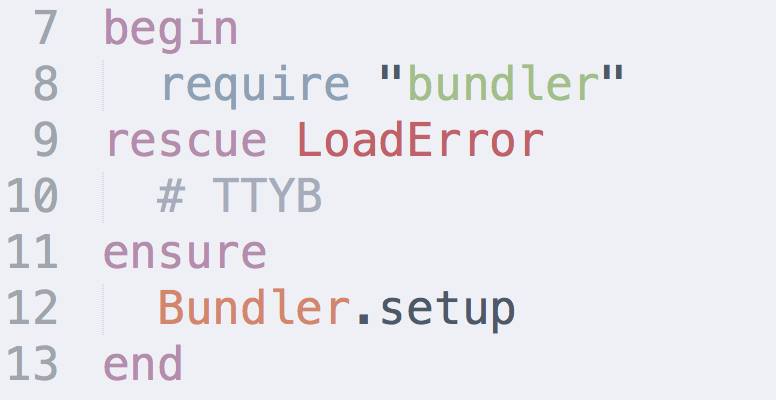
I was working on getting an old project updated, and I stumbled upon this beautiful artifact. #TTYB, or expanded: “Take that, you bitch!”
Why didn't I work harder to remember this? Why isn't #ttyb already in the common lexicon?
In this new age of hashtags, I encourage you to use this gem. And don’t limit yourself to apps/sites that recognize hashtags. I find hashtags are used best in mediums where they serve no special purpose, like email, text messages, and hand-written notes.
Update: Here’s another example of a fine use of this hashtag, in my recent instagram post.
We all had tried our fair share of todo list apps, and none of them quite did the job. A friend of mine swore highly of his very low-tech system: write down the next three things he was going to accomplish, immediately followed by doing them. In a world of overly complex productivity solutions, this worked surprisingly well.
We started talking about creating a web-app that would better mimic this simple approach, called “Daily Goals”.
Common Problems With Todo Software
People tend to put too much on their lists, leaving many tasks unfinished at the end of the day.
Most Todo list software is either boring, overly-complex, or too open ended. We felt that with the right UI and right messaging, things could be made much better.
How Daily Goals Would Be Different
Focus all messaging on what could be done today.
Make our UI stand out, by not taking the typical approach to the problem.
Don’t allow more than 3-5 incomplete tasks on the list at a time.
Don’t automatically carry over unfinished tasks from the previous day.
Design Principles
Simple things should be simple, and complex things shouldn’t be too hard.
Talk to your users like they’re humans. Light, playful messaging is key.
“Boring software is broken software.”
Sketches
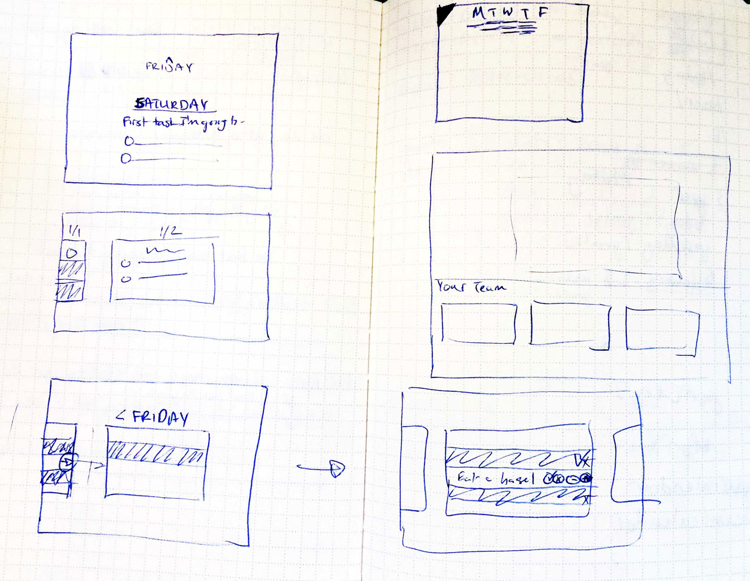
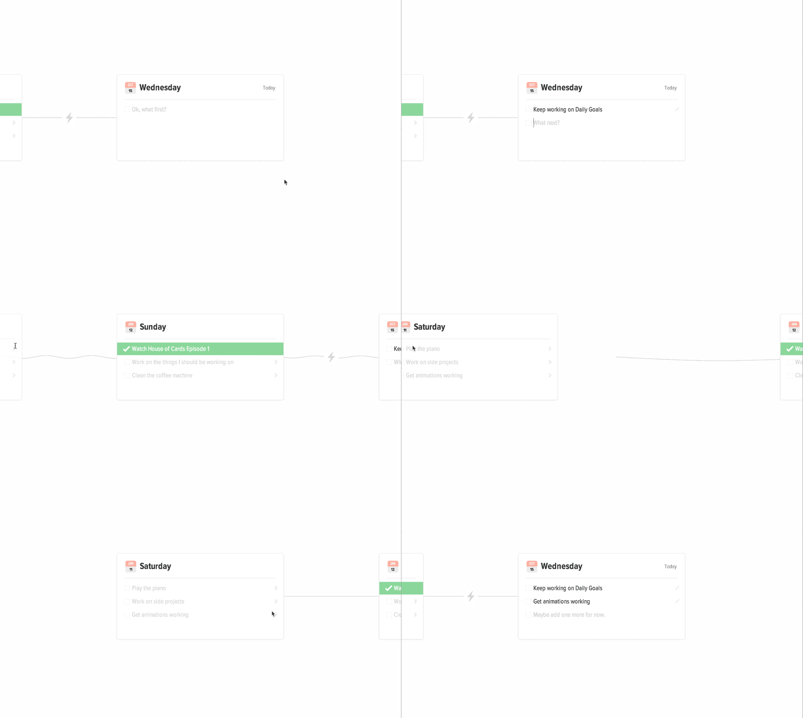
Instead of representing each day’s tasks as a flat list, we thought it would be interesting to represent it as a linear timeline, with each day represented as a card. To the left of today: yesterday. To the right: tomorrow.
The card for “Today” would be focused when the user logs in.
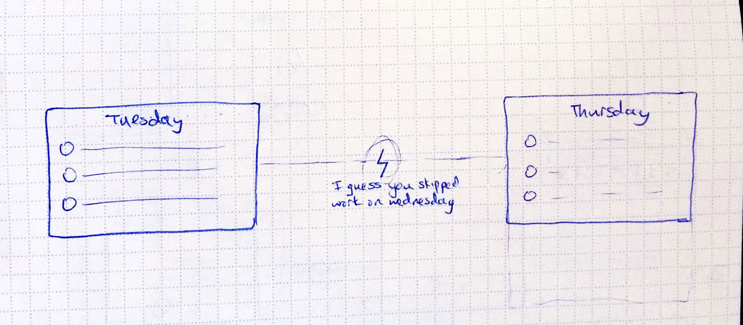
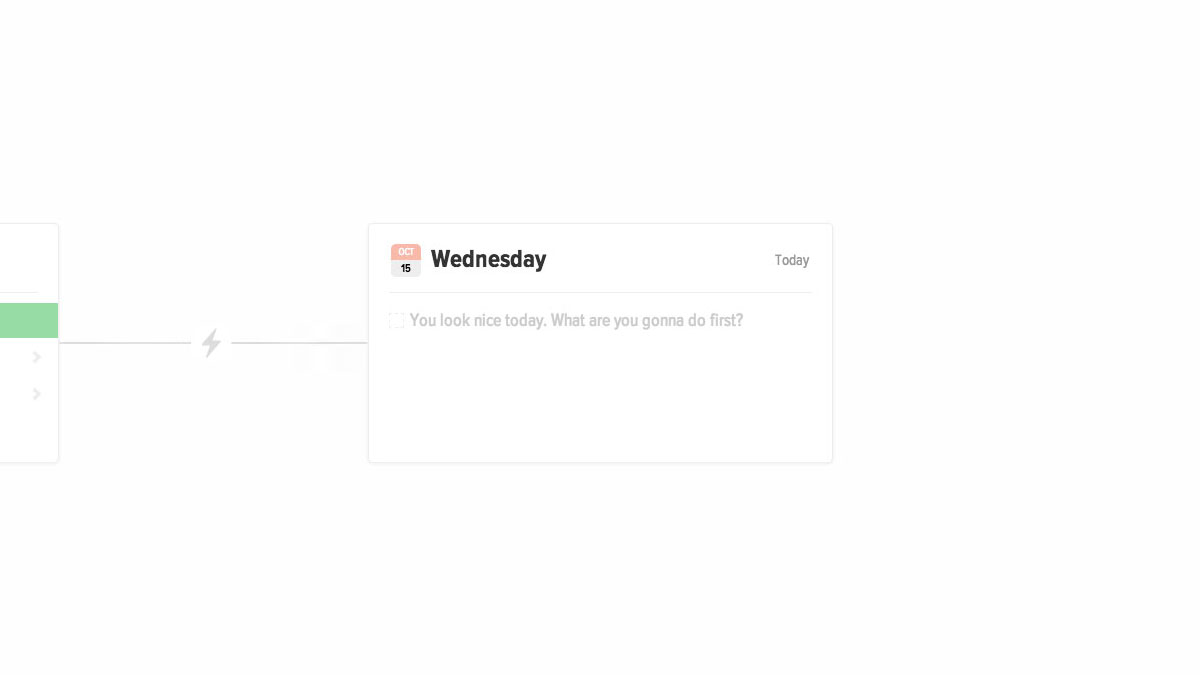
If a user hadn’t visited in a while, instead of showing them blank cards without any tasks filled in, we would mark gaps in the timeline with an icon on the line connecting the two cards. When hovering over the icon, we would reveal a short message, taking a stab at why they were missing those days.
Skipped day concept
In the sketch above, it says “I guess you skipped work on Wednesday.”
If they were gone for weeks, we’d have an icon of an island with a message that said “Have a nice vacation?”
Comps
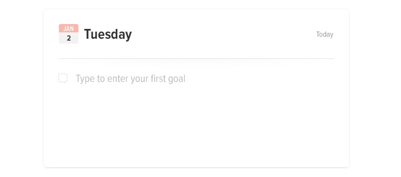
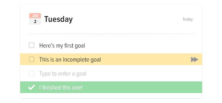
The design would be big, minimal, simple, interactive, and playful.
Blank CardFilled card concept
Messaging
Good messaging is essential. It gives your app personality, and makes users feel more closely connected to it. In terms of errors, it can mean the difference between someone forgiving you, and someone bailing.
Welcome messages
Well, you do.
For welcome prompts, we used custom messages based on the time of day.
If it was morning: “It’s going to be a productive day. Enter your first goal.”
If it was late morning: “What can you get done before lunch?”
If it was past midnight: “Burning the midnight oil?”
Entering too many tasks
In order to prevent too many tasks from piling up, and to help discourage users from entering very large tasks, the messaging changes depending on what they’ve entered. When prompting for more tasks, each message is different, depending on how many tasks they had entered and had completed.
Interactions
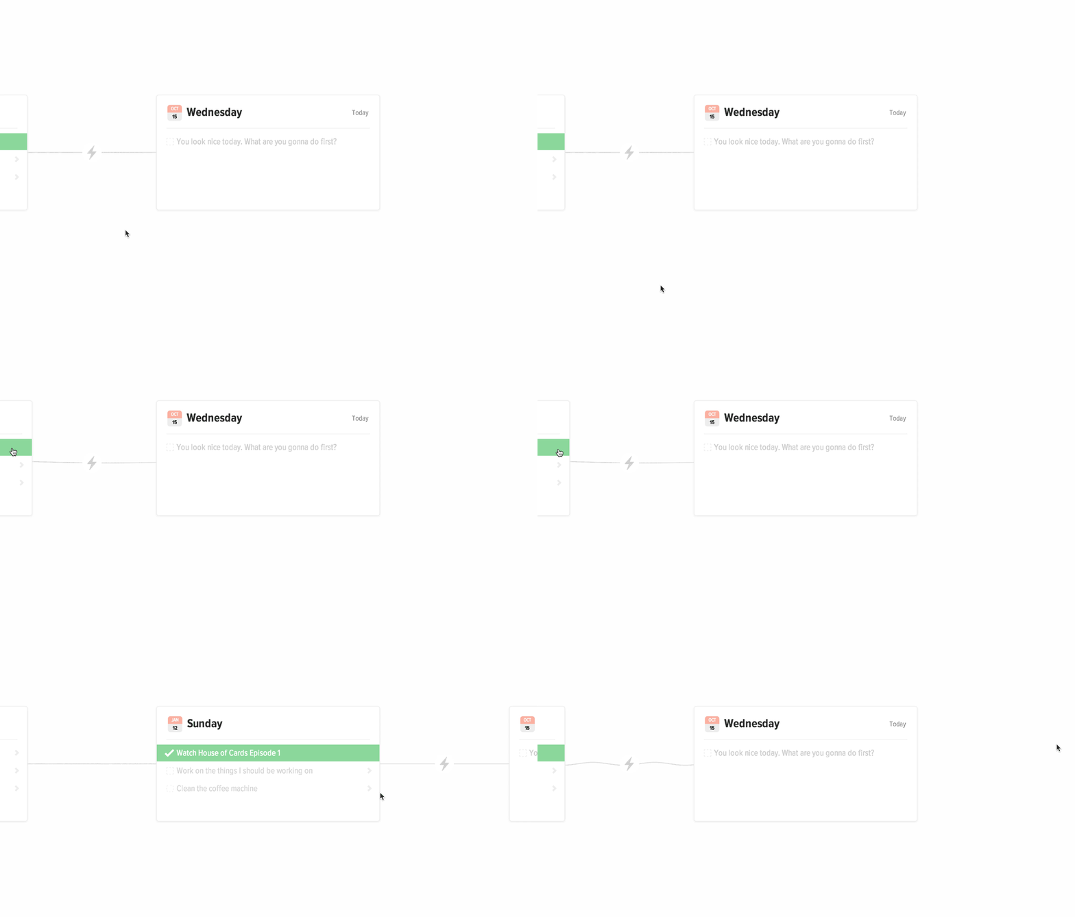
Adding small delighters are vital to a great user experience; the details make a world of difference. Once we settled on the timeline concept, with each card connected by a piece of string, we took it even further by making the string elastic.
Moving between days
In order to get this to work, we positioned a canvas element between the cards, and drew the connecting line on the canvas. Then, whenever the card moved, we calculated how much it moved, and updated the canvas with the correct arc. Took some effort? Yes. Worth it? Definitely.
When moving between days, the cards snap into place and you can see the wave move down the string. When hovering over a card on the left or the right, the card peeks out, causing the string to droop.
Moving tasks between days
This was really fun to make happen.
When moving an incomplete task from a previous day to Today, the task jumps off the page while the timeline shifts behind it.
Demo
Here’s a working demo you can look at it. There are definitely bugs, but the concepts are there.
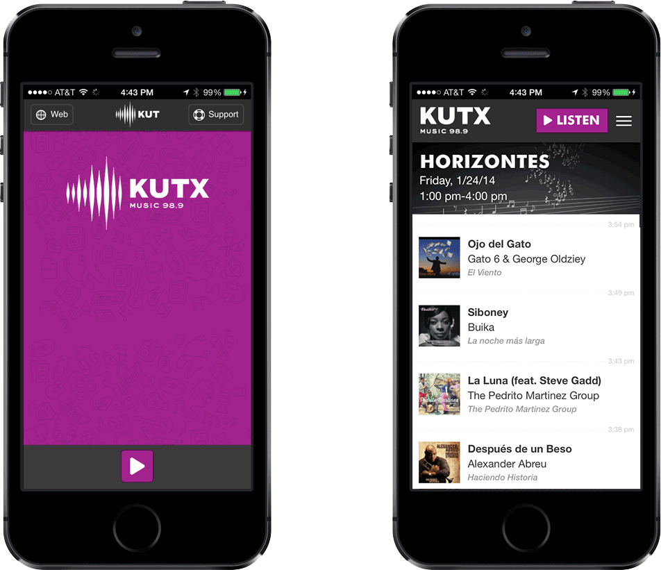
The KUTX mobile experience was in a sorry state. It’s so bare-bones, it doesn’t even feel minimal; it feels broken. After a friend pointed out that the iPhone app was built using Cordova and Angular, and how easy it was to extract that source code from the .ipa file, I got to work. With KUTX’s first birthday coming up just around the corner, I figured a much improved iPhone app would be a great birthday gift.
Old app on the left, new app on the right, obviously.
Their playlist was freely available on their website and all loaded via javascript, so finding API urls was easy. Soon enough, I had the angular app loading up the current playlist.
Layout
I mimiced the aesthetic of their recently redesigned website, sticking with Futura for the font, but some changes had to be made with how data was being formatted.
The two primary questions we’re trying to answer with a radio playlist are “What’s currently playing?” and “What just played?”
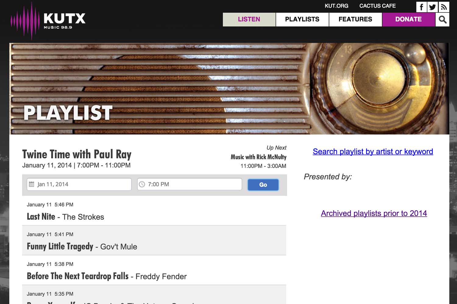
The website shows this data, but the way it’s displayed is problematic. With the currently broadcasting show and the most recently updated playlist right next to each other, it seems like they’re connected. And when DJs update their playlists frequently, they are. But not all do. Paul Ray just don’t give a damn about online playlists when he’s spinning 45s from the 50s, so when Twine Time is playing, the playlist directly below it displays what played hours ago.
That ain't good. Paul Ray didn't play the Strokes. Believe me.
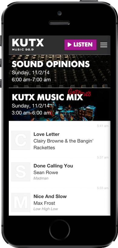
So to fix that in the mobile app, I grouped the tracks by show, and displayed them all linearly. If a show doesn’t have any playlist data, you still see the name of the show, and the times it played.
Album Art
The API they were using to pull down tracks had album art available—but not for all the tracks. When it’s available, it’s really nice to see, but when it’s not, we don’t want to leave a blank square.
So instead I used the first letter of the artist name as the album art. Still visually interesting enough to not look broken, until their APIs got better at providing album art.
For background art on the show listings, I used images from their website so that there wouldn’t be any problems with licensing rights.
Happy Birthday, KUTX
I figured giving them this functioning app would be easy—I just needed a contact at KUTX. I posted the app on the Austin sub-reddit where it got much interest, and for a few days it was #1. From some tips I got from that thread, I found out who the guy I needed to talk to was. So one morning I walked into KUTX, asked to speak with him, and gave him a demo, and talked about what I hoped to do—just give them all rights to the app.
Slam dunk, right?
Wrong. You would not believe how many layers of bureaucracy need navigating for a little app improvement like this to get through the university’s approval process. I learned the details in the hour chat we had, and to make a long story short, it couldn’t happen.
So now the source code sits unused on github, and is regularly used on my iPhone alone, while still—many months later—the featureless KUTX-built app is still on the App Store, frustrating KUTX listeners everywhere.
Also, can take a block of text and find all the valid tracking numbers within it.
1
2
3
4
5
6
7
8
9
10
11
12
13
14
15
text="Lorem ipsum dolor sit amet, consectetur adipisicing elit,
sed do eiusmod tempor incididunt ut labore et dolore
magna aliqua. Ut enim ad minim veniam, 1Z879E930346834440
nostrud exercitation ullamco laboris nisi ut aliquip ex
ea commodo consequat. Duis aute 9611020987654312345672 dolor
in reprehenderit in voluptate velit esse cillum dolore eu
fugiat nulla pariatur. Excepteur sint occaecat cupidatat
non proident, sunt in culpa qui officia deserunt mollit
anim id est laborum."TrackingNumber.search(text)#=> [TrackingNumber, TrackingNumber]
There’s a lot more information baked into a tracking number than you’d think.
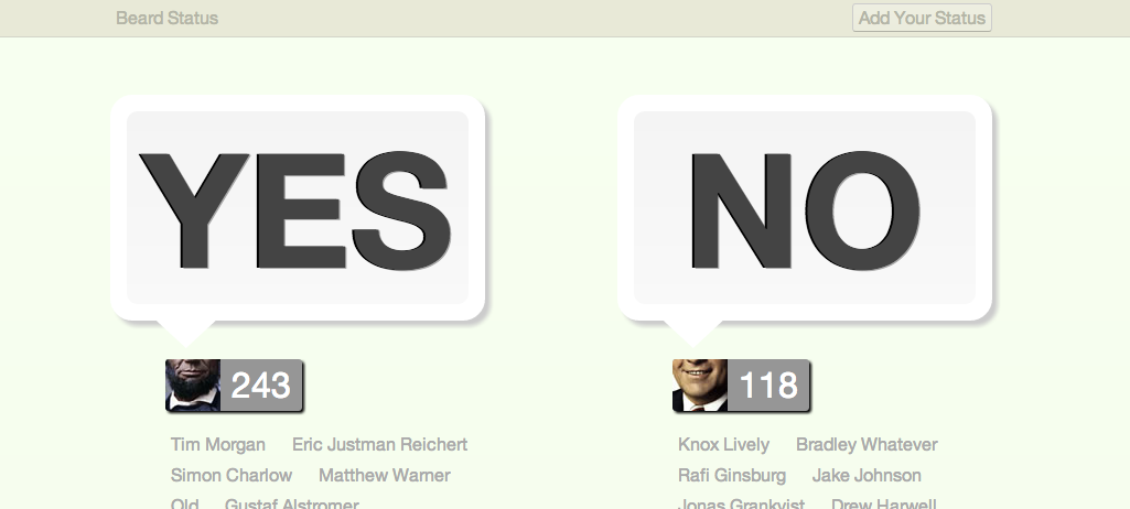
I came up with this during SXSW Interactive 2009. Seemed like the current internet rage was to add an ability to update your status—be it Facebook, Twitter, LinkedIn, or even Spiceworks—so I thought it’d be funny to make a site where you could update your Beard Status.
It was actually really fun to design and build, because it was so simple. And at the time, a simple app like this was especially attractive to me because I was being consumed by an extremely complicated application at work.
Beard Status got relatively popular for a while—there was a couple of day period where I was a pretty big deal on Twitter—but the hyped died down soon after that. I had plans to add more features to it, but so far I haven’t found the motivation to do so. It’s still there, though.
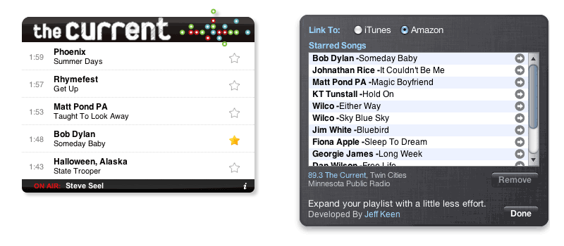
Whenever I listen to 89.3 the Current, I hear a lot of great music I haven’t heard before, and want to hear again. Before this widget existed, I’d have to figure out what song was playing, and then manually add it to my list of songs to buy sometime.
Later, I’d go through the list and decide what to buy.
This widget makes this whole routine much, much easier. Hear a song you like? Click on the star icon, and it’ll get added to the back of the widget. When you’re ready to buy, click the arrow next to the song to buy it on iTunes, or Amazon (your choice)
One Click Conversations allowed painless access to your recent Gmail conversations, in just one click. The demo below should explain things succinctly.
For a while this was pretty popular, and got included in Better Gmail. But then it ran into problems when Gmail changed several times, and is currently in a state of disrepair.
But the silent video below should give you a pretty good idea of what it does. Not the greatest demo video, but hey, in 2007 we didn’t have all these nice tools. Times were tough, man.