Posts tagged with #user experience

Blog

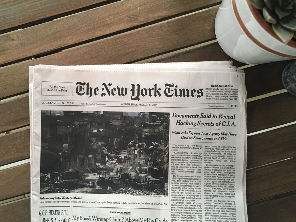
It’s 2017, and I subscribed to a physical newspaper. It gets delivered to my house every morning, and the first thing I do when I wake up is sneak out my front door in my underwear to get it.

In this time of fake news claims, pundits, and echo chambers, I thought it was important to support some real journalism. But instead of simply adding the NYT to my phone and getting a digital subscription, I decided to try out the physical paper.

I have to tell you: this was the best decision.

I’m reading things I never would have stumbled upon otherwise, and having an item that exists in the physical space that shows up five days a week has been a great way to interact with news, rather than having it be one of many notifications on a screen.

Dev Stuff

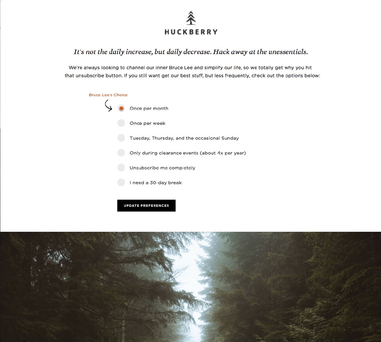
I have unsubscribed from so much junk lately. But when I came to unsubscribe from the Huckberry mailing list… I didn’t. And it was because of this delightful experience.

But I’ll probably unsubscribe next time it comes.

Dev Stuff

NYT just bought two of the most useful review sites on the internet for 30 Million dollars, and it’s amazing.

Matt Haugley said most of everything I want to say about this here, but let me tell you why I think this is really cool.

These sites solve a real problem in the best way. The problem being finding an answer to the question “What’s the best _____ to buy?”, and the best way being by just telling you which thing is best right away, backed up by an in depth writeup of how they decided that.

Most review sites will dive deep and dish out all the data of all the different choices, sandwiching advertising between sections for profit, and in the end not even give you a definitive answer leaving you to piece together all the data to form a conclusion.

The former experience is far superior.

Even more amazing, both of these sites were created by one guy in Honolulu, neither site is ad-supported (!!), and he didn’t take any VC funding!

As Matt said in his blog post:

I imagine every step of the development of the Wirecutter/Sweethome was about people laughing at Brian.

You can’t build a tech site that doesn’t publish 20 times a day. You can’t build a content site that isn’t covered with advertising. You can’t build an entire business on Amazon affiliate revenue. You can’t take on Consumer Reports and expect to get any traction. You can’t pay for this level of in-depth reporting. Ok, great, you built this, but why would anyone ever come back?

Ignore the haters and do it anyway. Amazing work, Brian Lam.

This was a really good interview with Brian about the sites, before it was purchased.

Dev Stuff

I was in Portland for Ember Conf recently, and after much research (natch), I stayed at the Hotel Eastlund. This is my new spot in Portland, and let me tell you why.

First: this rooftop bar.

The design of this hotel is amazing. Modern feel, with really nice touches that showed they really took the time to think about the experience. As someone who does UX work for a living, I noticed these touches, and I appreciated all of them. But there were two tiny little things that took my opinion of the place from being “Nice hotel”, to “Portland hotel search is over! I’m staying here every time.”

The first night I stayed there I was going to plug my phone in and go to bed, until I realized I forgot my phone charger. That’s when I noticed they already thought of that, and had charging cords for every type of modern phone on each bedside table. Nice touch.

But the following morning when getting ready, I noticed this shower detail:

Are you seeing this? A hole cut in the long glass shower wall so you can reach the knobs without getting sprayed with cold water? That is such a ridiculously thoughtful feature that I can’t stop gushing about it.

Stay here next time you’re in Portland.

Dev Stuff

From Reconsider:

Part of the problem seems to be that nobody these days is content to merely put their dent in the universe. No, they have to fucking own the universe. It’s not enough to be in the market, they have to dominate it. It’s not enough to serve customers, they have to capture them.

This. Fucking nailed it. One of the most frustrating things lately in technology is that nobody wants to play nice together. Everyone wants to have a platform, instead of providing a great service and while getting along with others. One simple example, look at the landscape of chat services, currently. There was a time, where there were different services, and different clients. Each service had a protocol that a client could conform to, and many clients supported those protocols. I used to chat to my AIM friends and my ICQ friends and my Google friends all within the same program.

Now, everything is a walled garden. Hangouts doesn’t have any third party clients, so I have to run a shitty chrome app to talk to use that. iMessage is its own deal. Facebook has its own thing.

But that’s just one example. Amazon provides great services. Apple makes great products. Apple and Amazon are both have competing products now, the Amazon Fire TV, and the Apple TV. Amazon won’t sell the Apple TV in its stores, and Apple doesn’t have an Amazon Instant Video app available with its services.

Did either of these moves increase loyalty? Improve consumer happiness? Speaking as a consumer: no. It’s only been an inconvenience.

Dev Stuff

We’ve all got those websites that seem to sap away our time. For me, it’s Facebook, Reddit, and Hacker News. For others, it’s Twitter, or ESPN.

I realized that given a free moment while working—like waiting for a file to download, or an app to start up—my muscle memory will kick in and I’ll command-T open a new tab in Chrome and start typing f-a-c or r-e-d-d. And before you know it, my productivity is getting chewed up by an endless stream of gifs, AMAs, and ice bucket challenge videos.

I’ve tried “productivity tools” that block websites completely, but I always felt that those solutions were too severe. I’m not an addict, where one sweet sweet taste of a friend’s flash-soaked concert-selfie will require me to join a twelve-step program; I just need to be reminded that hey, maybe this isn’t what I should be doing right now.

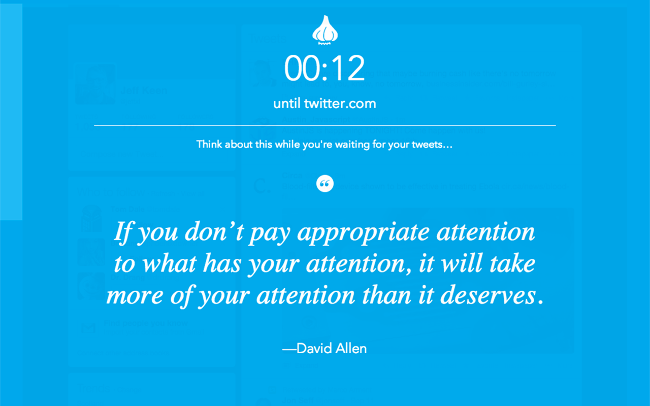
I wanted an extension that would just make me wait 15 seconds or so before letting me see those troublesome sites, with a reminder about what’s important.

After doing some searching, I found that this wasn’t an original idea. Randall Munroe, of xkcd, talked about it in a comic, and a couple of chrome extensions inspired from his comic already existed that did a similar thing. But the experience of these extensions was, pretty pretty poor.

Forcing a short delay is one piece of the puzzle, but how about adding a little inspiration to the mix, with a touch of playful shaming? Front and center: an inspiring quote about productivity. Something that puts some goals in perspective.

“Amateurs sit and wait for inspiration, the rest of us just get up and go to work.”—Stephen King

And then not as loud, but still visible, something to put what you’re trying to do in perspective, customized for each site.

“Honestly though, when was the last time this site brought you joy?”

Put all those bits together, and you’ve got Garlic. Add a 15 second delay plus a little extra motivation to keep you on task.

Dev Stuff

You use multiple passwords, right? Do some of your passwords just vary by the last character? Probably. reallylongpassword and reallylongpassword1, maybe.

In the clip below, I try logging into Instagram, using the first incorrect password, followed by the second variation.

gfycat embed “BrightSphericalIchneumonfly” — service shut down, needs replacing

See what happened there? The first password was wrong, so I thought I’d just edit it and add a 1 to the end of it, but when I tried to do that it cleared the field. This seems to be the norm in iOS apps, and it provides for a less than ideal experience.

There are two correct options, here.

  1. After entering an invalid password, clear and focus the field. This makes it obvious to the user that they have to retype their password.
  2. After entering an invalid password, don’t clear the field, but allow editing of the field’s contents. To avoid other mediocre experiences, you should also have a clear button on the right side of the input.

What you should definitely not do is make it seem like the field is editable by keeping the contents in there, and then clear it when the user tries to type in it. That’s just rude.

Dev Stuff

We all had tried our fair share of todo list apps, and none of them quite did the job. A friend of mine swore highly of his very low-tech system: write down the next three things he was going to accomplish, immediately followed by doing them. In a world of overly complex productivity solutions, this worked surprisingly well.

We started talking about creating a web-app that would better mimic this simple approach, called “Daily Goals”.

Common Problems With Todo Software

  1. People tend to put too much on their lists, leaving many tasks unfinished at the end of the day.
  2. Most Todo list software is either boring, overly-complex, or too open ended. We felt that with the right UI and right messaging, things could be made much better.

How Daily Goals Would Be Different

  1. Focus all messaging on what could be done today.
  2. Make our UI stand out, by not taking the typical approach to the problem.
  3. Don’t allow more than 3-5 incomplete tasks on the list at a time.
  4. Don’t automatically carry over unfinished tasks from the previous day.

Design Principles

  1. Simple things should be simple, and complex things shouldn’t be too hard.
  2. Talk to your users like they’re humans. Light, playful messaging is key.

“Boring software is broken software.”

Sketches

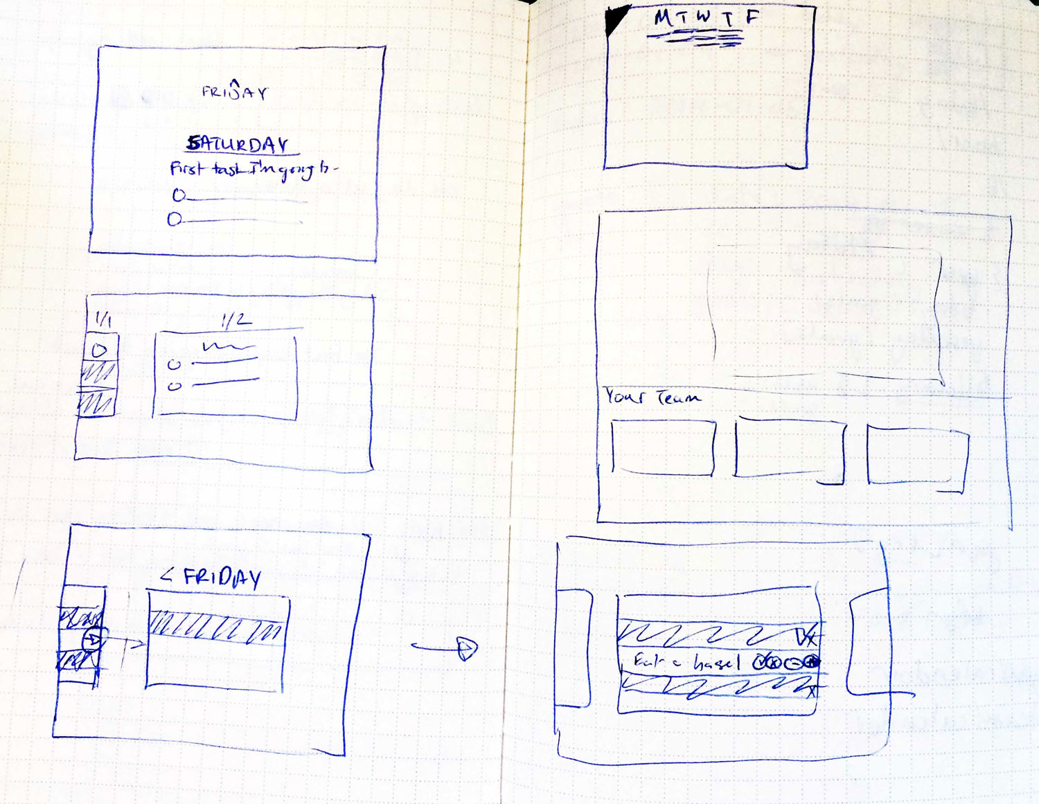
Instead of representing each day’s tasks as a flat list, we thought it would be interesting to represent it as a linear timeline, with each day represented as a card. To the left of today: yesterday. To the right: tomorrow.

The card for “Today” would be focused when the user logs in.

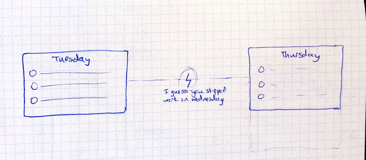
If a user hadn’t visited in a while, instead of showing them blank cards without any tasks filled in, we would mark gaps in the timeline with an icon on the line connecting the two cards. When hovering over the icon, we would reveal a short message, taking a stab at why they were missing those days.

Skipped day concept
Skipped day concept

In the sketch above, it says “I guess you skipped work on Wednesday.”

If they were gone for weeks, we’d have an icon of an island with a message that said “Have a nice vacation?”

Comps

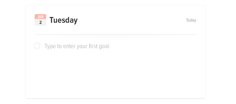
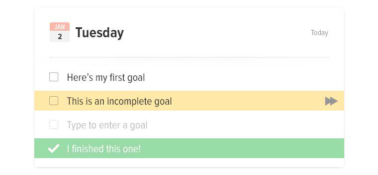
The design would be big, minimal, simple, interactive, and playful.

Blank Card
Blank Card
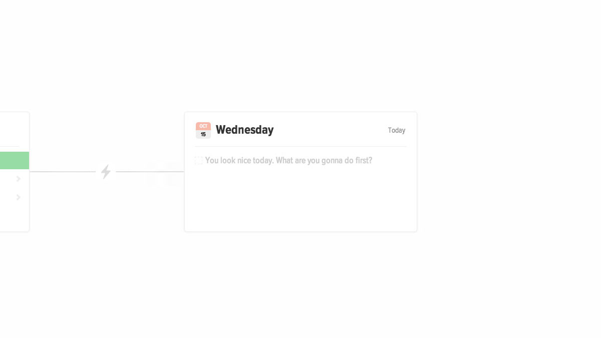
Filled card concept
Filled card concept

Messaging

Good messaging is essential. It gives your app personality, and makes users feel more closely connected to it. In terms of errors, it can mean the difference between someone forgiving you, and someone bailing.

Welcome messages
Well, you do.
Well, you do.

For welcome prompts, we used custom messages based on the time of day.

If it was morning: “It’s going to be a productive day. Enter your first goal.”

If it was late morning: “What can you get done before lunch?”

If it was past midnight: “Burning the midnight oil?”

Entering too many tasks

In order to prevent too many tasks from piling up, and to help discourage users from entering very large tasks, the messaging changes depending on what they’ve entered. When prompting for more tasks, each message is different, depending on how many tasks they had entered and had completed.

Interactions

Adding small delighters are vital to a great user experience; the details make a world of difference. Once we settled on the timeline concept, with each card connected by a piece of string, we took it even further by making the string elastic.

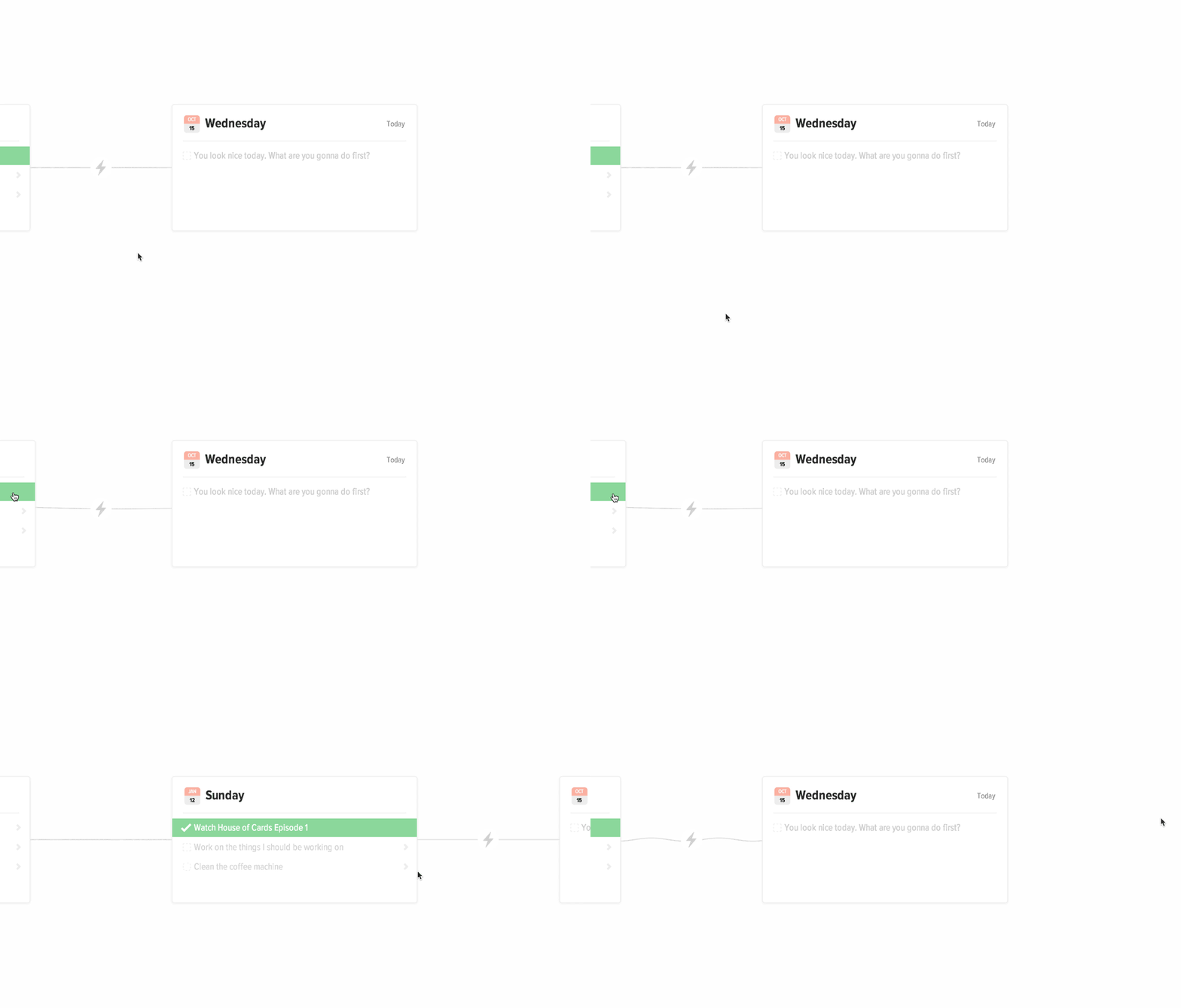
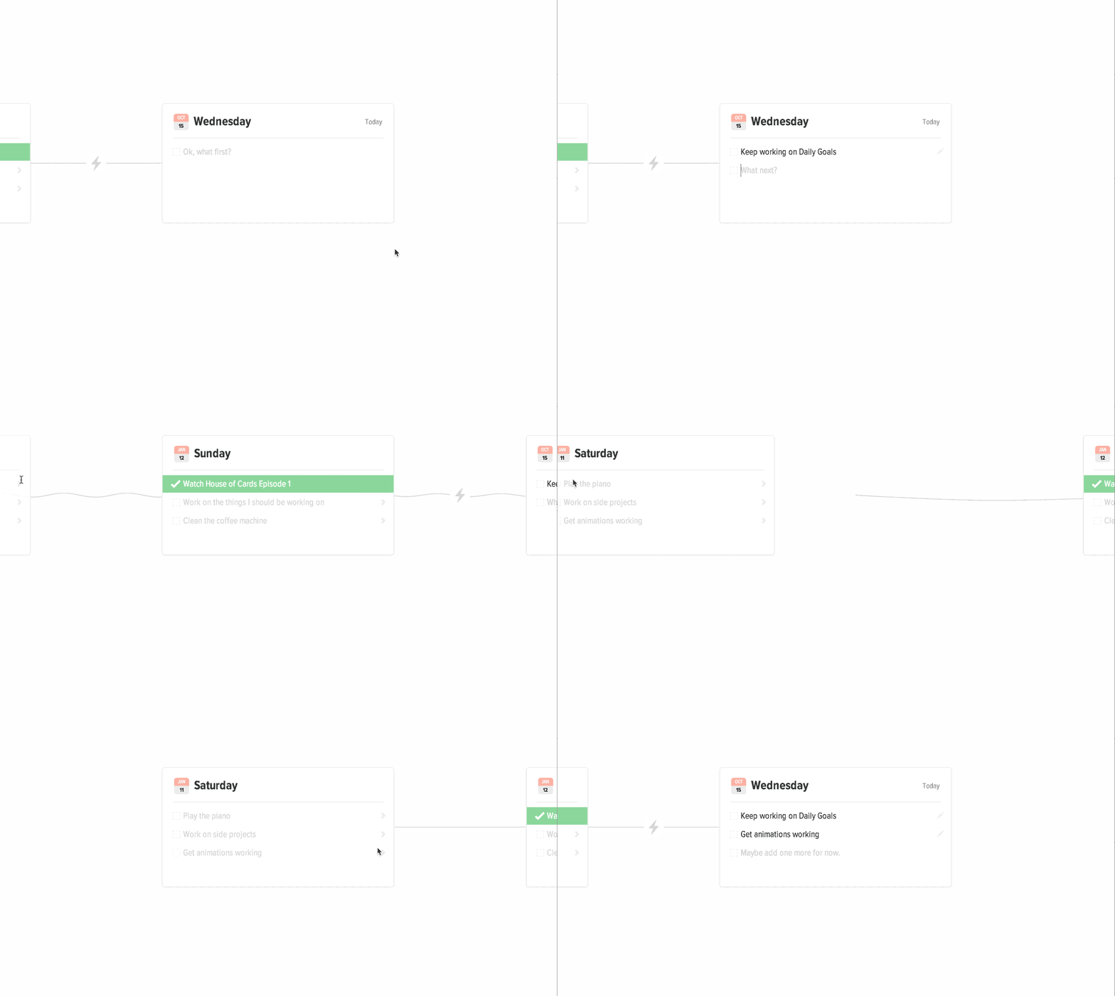
Moving between days
In order to get this to work, we positioned a canvas element between the cards, and drew the connecting line on the canvas. Then, whenever the card moved, we calculated how much it moved, and updated the canvas with the correct arc. Took some effort? Yes. Worth it? Definitely.

When moving between days, the cards snap into place and you can see the wave move down the string. When hovering over a card on the left or the right, the card peeks out, causing the string to droop.

Moving tasks between days
This was really fun to make happen.

When moving an incomplete task from a previous day to Today, the task jumps off the page while the timeline shifts behind it.

Demo

Here’s a working demo you can look at it. There are definitely bugs, but the concepts are there.

Dev Stuff

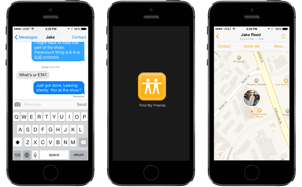
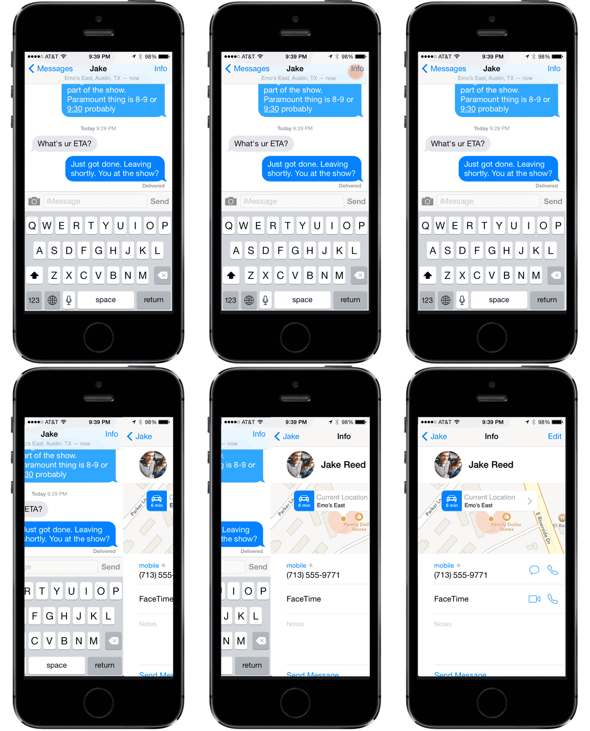
It would be really nice if Messages knew about the people I had on Find My Friends. Right now there’s a disconnect that really doesn’t need to be there.

It works. It’s fine. But you know what would be better? Something like this:

Location in the same app, even on the main messages screen

Taking it even further

iOS also has capabilities to detect what you’re doing, such as walking, driving, etc, and I think it’d be really nice if it also said that.

Driving, especially. If the person who just texted me knew I was driving, they might understand why I’m not responding right away. Because I’m being safe, or whatever.

Update: 10/2014. iOS8 Implemented this feature, pretty much just how I outlined in my comp, minus the small text under the name on the main screen. I’ll take it. Much better.

Dev Stuff

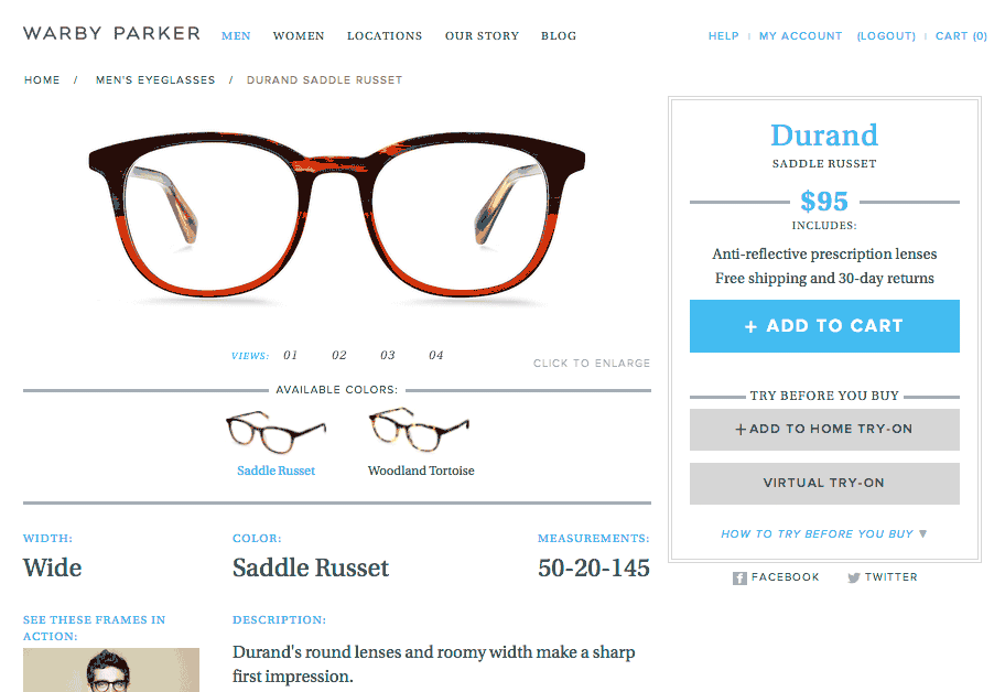
When it’s so easy to pick five frames and try them on, it sure would be helpful to know which I’ve tried before and which I haven’t.

And it’d be so easy, too. They know my order history, and I’m logged in. Why not something like this?

“You ordered the Woodland Tortise color in Februrary 2014 and returned them.”

Dev Stuff

At Spiceworks, we really wanted to stop supporting older versions of IE, but understood from the stats we collected that 5-10% of our users were still on old versions. So we came up with an upgrade strategy.

Whenever you’re asking someone to do something that might be a little unpleasant, it helps if you make it enjoyable, or funny. That’s basic User Experience. Take their mind off the bad part— “You want me to what?”—by distracting them with laughs.

So catering to an audience of IT guys, I thought making an Office Space joke would be appropriate.

And apparently it worked, because it just made it to the front page of reddit today!

Dev Stuff

I was recently looking for an alarm clock, and had some simple qualifications for suitable models.

  1. Should not take up the entire nightstand; small is good.
  2. Alarm clock should be visible in the dark, without lighting up the entire room.
  3. Must have radio function.

Seems simple, but finding an alarm clock that meets these three requirements are surprisingly difficult.

I think that manufacturers of electrical devices feel that producing an alarm clock is such an easy task, they might as well; they’ve got the parts, they’ve got the people, why not throw something out there? I also imagine they give the least experienced engineer to design this thing, as it’s a relatively straightforward task, and consequences of failure are minimal. I really doubt that they put much thought into the process, because if someone really thought about designing a great alarm clock, wouldn’t we have seen one with a keypad long ago?

Problem encountered on the majority of alarm clocks: Setting the time is difficult for the average human, and in some cases difficult for the advanced human. (See explicit hotel printout on how to set the alarm.)

Logically, you’d think a problem that inhibits a customer from successfully using your product would be on the top of the list of things-to-fix-right-now. Unfortunately, this problem has been largely ignored in the alarm clock world, and instead alarm clock manufacturers have seemingly focused on the following non-problems:

  1. The numbers aren’t big enough.
  2. The numbers aren’t bright enough.
  3. The numbers aren’t being projected onto my ceiling.

The alarm clock I currently have, which is bigger and brighter than it needs to be actually has a “dim” toggle switch which I always have in the “on” position. I can’t imagine why anyone wouldn’t have that enabled because without it the blue display is blinding. Alarm Clock/Radio/Night-light?

It also seems like more and more manufacturers are going away from the classic red letters, which were bright enough to see easily in a dark room while not being confused for a night light, and instead opting for super-bright blue, or green displays. Was there anything wrong with red?

If that wasn’t enough, some manufacturers started adding projectors to their feature list. Oh god, why? How on earth did “Add useless projector to alarm clock” rise above “Make alarm clock usable” on the priority list?

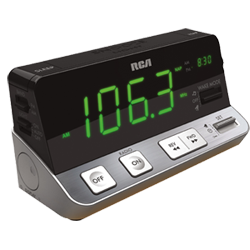
Getting back to my search, after looking through hundreds of alarm clocks online, I found one that was actually pretty impressive, in terms of design: The RCA RPC100.

It’s surprisingly well laid-out, having clearly marked “AM/PM” instead of cryptic dots1, nice looking buttons, pretty sleek looking design over all, and a killer feature (in the alarm clock world, anyway) of having the set alarm time display in the upper right corner of the display2. The green display might be a little brighter than necessary, but I was willing to overlook that because of the strength in the other areas. It actually looks like someone actually designed this thing, rather than just perpetuating the mistakes other manufacturers have made over the years.

There’s a catch, though. This thing is nine inches wide. Nine inches!? That is a monstrous alarm clock.

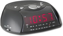
I still really haven’t found the perfect alarm clock, devoid of all design flaws, but I did find one that seemed to come from a simpler time, where red displays and a small footprint were still the norm. The Insignia NSC211, sold by Best Buy for a mere $10.

It’s not an example of a great alarm clock, but it’s not bad.

What’s your favorite alarm clock?

Dev Stuff

I’m not usually one to lament about how technology has changed our lives, and what life was like before [something] changed everything. “We used to have to get up and change the channel on the TV, and we liked it!”. I don’t miss that.

But what I do miss, in some ways, is how I used to enjoy my music. I used to like browsing used music stores, and if I happened to stumble upon something I’d been looking for, I’d buy it, take it home, put it in the CD player, and enjoy it while admiring the cover of the album and reading the liner notes.

When just casually wanting to put on some music I used to open up my CD cabinet and scan my collection until something caught my eye. If I filled my 5 disc CD player I’d get around 5 or 6 hours of music without any repeated songs.

On one hand, I don’t miss driving around town trying to find obscure albums and love the fact that now I can go from thinking about how I want to hear a song to owning that song in less than 30 seconds, without ever leaving my chair.

But on the other hand, I sorely miss the once-clear definition between an album and a mix tape. Listening to albums used to the norm for me, while listening to a mix tape was more of an unusual occurrence. When I thought about listening to music, I didn’t think “I want to hear this song”, I thought, “I want to hear this album”. iTunes Party Shuffle completely reversed my thinking, and I guess I just sat back and let it.

And I’m a little bitter about it.

Party Shuffle is easy. It seems like a great idea to just select my top rated songs smart playlist, and shuffle away. There are problems with this, though. First, shuffle is surprisingly poor at really shuffling songs, and as a result is very good at making you sick to death of a few songs, or artists. Tragically, I had to unrate the Who because of this. As much as I love them, I need to take a long break before I can really enjoy them again.

This burn-out shuffle problem can be alleviated somewhat by creating a smart playlist with the much needed “has not been played in the last week”, I found out, but really, this shouldn’t be a problem in the first place.

I really wanted to start listening to Albums again, but when browsing through a Library of 706 artists, and 1129 Albums, it was hard to scan through my choices, as I used to with my CD collection. Maybe it’s just me, but if I don’t see the cover of Tonight’s The Night, I sometimes forget it exists and will go months without ever considering it as a listening choice.

What would be great is if iTunes would actually comprehend the fact that music is not just a library of singles, but rather a library of complete and incomplete albums, with some singles thrown in. Albums should be considered their own entity, if specified, meaning Albums could have ratings, play counts, and all the rest of the data songs have.

On that same path of thought, ratings need to be much much smarter. I want the ability to find all the albums that contain at least 4 songs I’ve rated higher than 3 stars, that I haven’t listened to in the last 2 months. I want to be able to find the songs whose ratings have increased in the last week, which would be extremely useful for figuring out what my current favorites are. Give me something I can work with, Apple. I’ve been wanting to write a better ratings plugin for a long time now, but the hurdle of figuring out how to do that is a little daunting. It’s on the list, though.

I made a small step in returning to my previous listening style last week, when I spent some time going through my library and adding “[Album]” to the “Grouping” field of all songs that were part of a full album. I then made a smart playlist showing only those songs, and also made sure that every album in that list had Album art (which is much easier than making sure my entire library, with lots of singles and incomplete albums has album art). Now, using CoverFlow, or List view, I can browse my albums with an ease I never experienced before in iTunes.

It’s a long way from ideal, but it’s a start.
Dev Stuff

The iPhone launches this Friday, and I can’t wait. For months, the hype has been hard to avoid. Hype has never had the intended effect on me; rather than piquing my interest and compelling me to round up my camping gear for product launch day, it raises my skepticism. However, the closer we get to launch day, the more convinced I’m becoming that this phone really will live up to all the hype.

The short demos Steve gave at WWDC and at MacWorld were impressive, but what really won me over was the guided tour of the phone I watched yesterday. Since when has a cell phone been really intuitive to use?

Horrible cell phone user interfaces have become so common it’s always a surprise to discover a phone that’s “not as horrible”, and downright shocking when I see one that really is easy to use. I’ve berated Motorola’s awful interfaces to Motorola employees (well, my brother), and I still marvel at some companies’ blatant disregard for anyone who actually wants to use their products. Can you honestly imagine a similar “guided tour” of Motorola’s RAZR?

“It’s thin.”

Do you think they’d point out the fact that some menu options on the home screen are in all caps, and some aren’t? Or that the font-size is too large, so that “ADDRESS BOOK” is truncated? How about the seemingly random shortening of menu options, like “SpkrPhone”, when screen space is clearly available? And that’s just aesthetics.

As I recall from a harrowing experience of trying to set up an old Motorola phone, the process of adding contacts seemed to be designed using some sort of reverse polish logic, because I had to lower my intelligence level to that of an advanced cave-man in order to successfully complete this simple task. It made me wonder if anyone actually tried using the phone before launching it out into the world? Or perhaps, did they know full well that the UI was horrible, but also knew that the general public’s expectations of cell phones were so low, that they would still wait in line for it, simply because it was thin?

Well, for once someone is changing the game. With the iPhone, Apple’s engineers appear to have actually thought about how people will use the phone, and designed their interface around that. And now other companies are going to have to follow suit.

Some companies have been better than others—Sony Ericsson, and LG, for instance—but I don’t think they’ve done it well enough and aren’t main stream enough for consumers to really take notice. Apple has, and Apple is, though.

For instance, I’ve been wishing for a way to separate my phone book into the people I call often and the people I don’t ever since I got a cell phone. I have numbers of people who I haven’t talked to in years, and although I don’t want to delete them, I also don’t want to scroll by them to get to the number I really want to call. “Favorite contacts” on the iPhone allows you to do just that. And it’s about time.

This Friday’s launch of the iPhone will usher in a new era of cell phone standards. I hope that it straightens out what type of experience phone manufacturers put into their products, and more importantly, what consumers demand of their phones. Because honestly, how many clicks should it take to add your friend to your address book? Don’t you have better ways to waste your time?