I was recently looking for an alarm clock, and had some simple qualifications for suitable models.
- Should not take up the entire nightstand; small is good.
- Alarm clock should be visible in the dark, without lighting up the entire room.
- Must have radio function.
Seems simple, but finding an alarm clock that meets these three requirements are surprisingly difficult.
I think that manufacturers of electrical devices feel that producing an alarm clock is such an easy task, they might as well; they’ve got the parts, they’ve got the people, why not throw something out there? I also imagine they give the least experienced engineer to design this thing, as it’s a relatively straightforward task, and consequences of failure are minimal. I really doubt that they put much thought into the process, because if someone really thought about designing a great alarm clock, wouldn’t we have seen one with a keypad long ago?
Problem encountered on the majority of alarm clocks: Setting the time is difficult for the average human, and in some cases difficult for the advanced human. (See explicit hotel printout on how to set the alarm.)
Logically, you’d think a problem that inhibits a customer from successfully using your product would be on the top of the list of things-to-fix-right-now. Unfortunately, this problem has been largely ignored in the alarm clock world, and instead alarm clock manufacturers have seemingly focused on the following non-problems:
- The numbers aren’t big enough.
- The numbers aren’t bright enough.
- The numbers aren’t being projected onto my ceiling.
The alarm clock I currently have, which is bigger and brighter than it needs to be actually has a “dim” toggle switch which I always have in the “on” position. I can’t imagine why anyone wouldn’t have that enabled because without it the blue display is blinding. Alarm Clock/Radio/Night-light?
It also seems like more and more manufacturers are going away from the classic red letters, which were bright enough to see easily in a dark room while not being confused for a night light, and instead opting for super-bright blue, or green displays. Was there anything wrong with red?
If that wasn’t enough, some manufacturers started adding projectors to their feature list. Oh god, why? How on earth did “Add useless projector to alarm clock” rise above “Make alarm clock usable” on the priority list?
Getting back to my search, after looking through hundreds of alarm clocks online, I found one that was actually pretty impressive, in terms of design: The RCA RPC100.
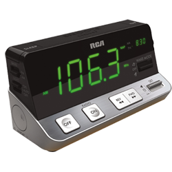
It’s surprisingly well laid-out, having clearly marked “AM/PM” instead of cryptic dots1, nice looking buttons, pretty sleek looking design over all, and a killer feature (in the alarm clock world, anyway) of having the set alarm time display in the upper right corner of the display2. The green display might be a little brighter than necessary, but I was willing to overlook that because of the strength in the other areas. It actually looks like someone actually designed this thing, rather than just perpetuating the mistakes other manufacturers have made over the years.
There’s a catch, though. This thing is nine inches wide. Nine inches!? That is a monstrous alarm clock.
I still really haven’t found the perfect alarm clock, devoid of all design flaws, but I did find one that seemed to come from a simpler time, where red displays and a small footprint were still the norm. The Insignia NSC211, sold by Best Buy for a mere $10.
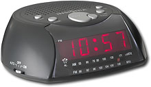
It’s not an example of a great alarm clock, but it’s not bad.
What’s your favorite alarm clock?