We all had tried our fair share of todo list apps, and none of them quite did the job. A friend of mine swore highly of his very low-tech system: write down the next three things he was going to accomplish, immediately followed by doing them. In a world of overly complex productivity solutions, this worked surprisingly well.
We started talking about creating a web-app that would better mimic this simple approach, called “Daily Goals”.
Common Problems With Todo Software
- People tend to put too much on their lists, leaving many tasks unfinished at the end of the day.
- Most Todo list software is either boring, overly-complex, or too open ended. We felt that with the right UI and right messaging, things could be made much better.
How Daily Goals Would Be Different
- Focus all messaging on what could be done today.
- Make our UI stand out, by not taking the typical approach to the problem.
- Don’t allow more than 3-5 incomplete tasks on the list at a time.
- Don’t automatically carry over unfinished tasks from the previous day.
Design Principles
- Simple things should be simple, and complex things shouldn’t be too hard.
- Talk to your users like they’re humans. Light, playful messaging is key.
“Boring software is broken software.”
Sketches
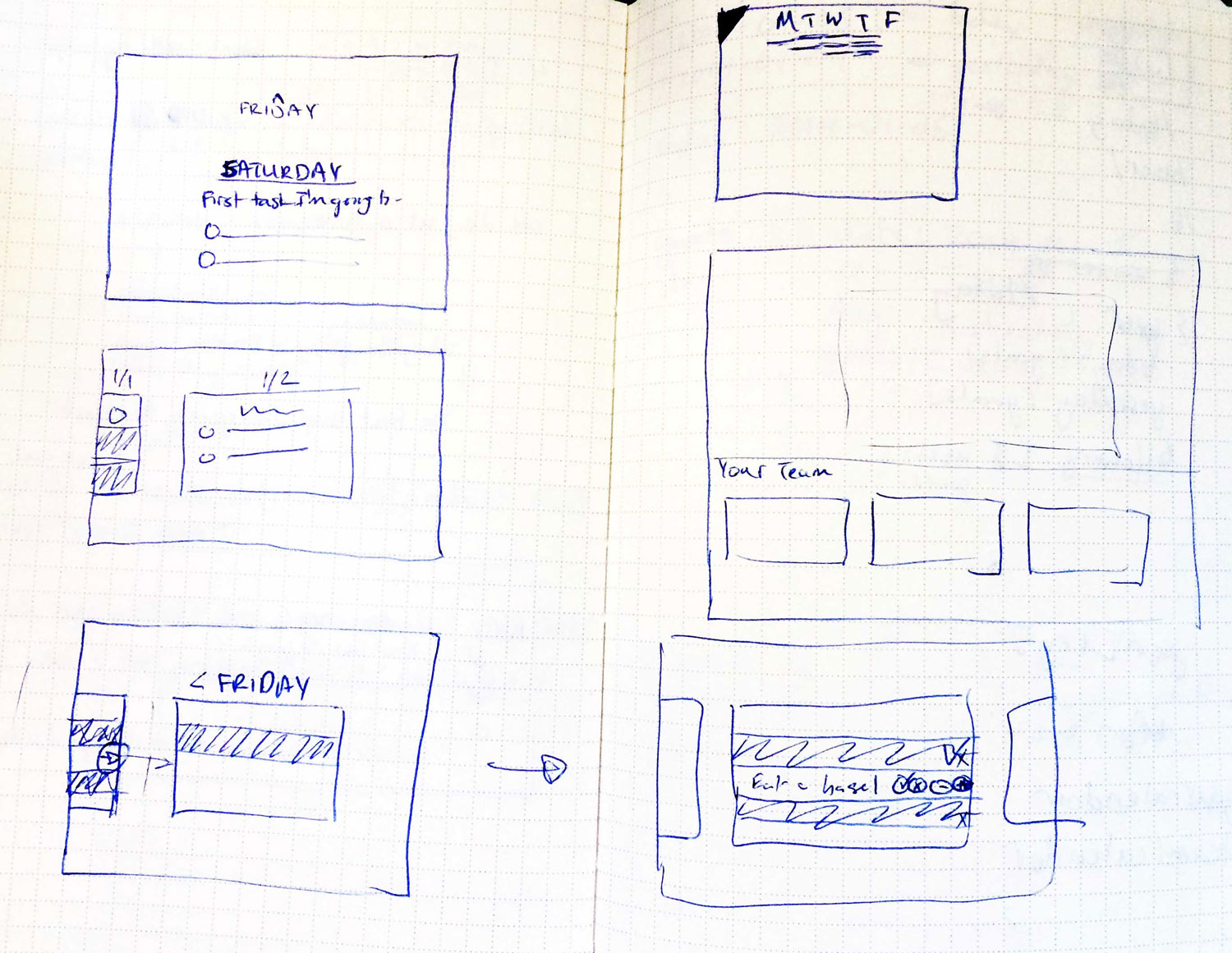
Instead of representing each day’s tasks as a flat list, we thought it would be interesting to represent it as a linear timeline, with each day represented as a card. To the left of today: yesterday. To the right: tomorrow.
The card for “Today” would be focused when the user logs in.
If a user hadn’t visited in a while, instead of showing them blank cards without any tasks filled in, we would mark gaps in the timeline with an icon on the line connecting the two cards. When hovering over the icon, we would reveal a short message, taking a stab at why they were missing those days.
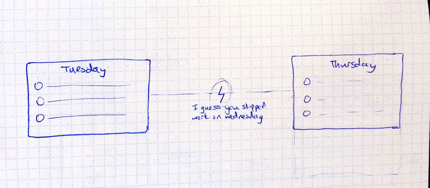
Skipped day concept
In the sketch above, it says “I guess you skipped work on Wednesday.”
If they were gone for weeks, we’d have an icon of an island with a message that said “Have a nice vacation?”
Comps
The design would be big, minimal, simple, interactive, and playful.
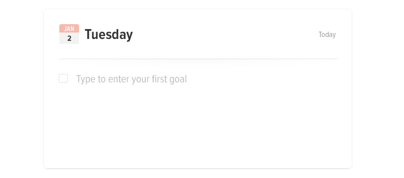
Blank Card
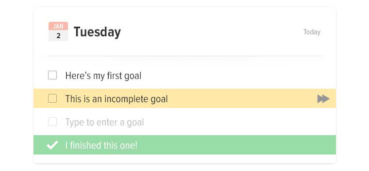
Filled card concept
Messaging
Good messaging is essential. It gives your app personality, and makes users feel more closely connected to it. In terms of errors, it can mean the difference between someone forgiving you, and someone bailing.
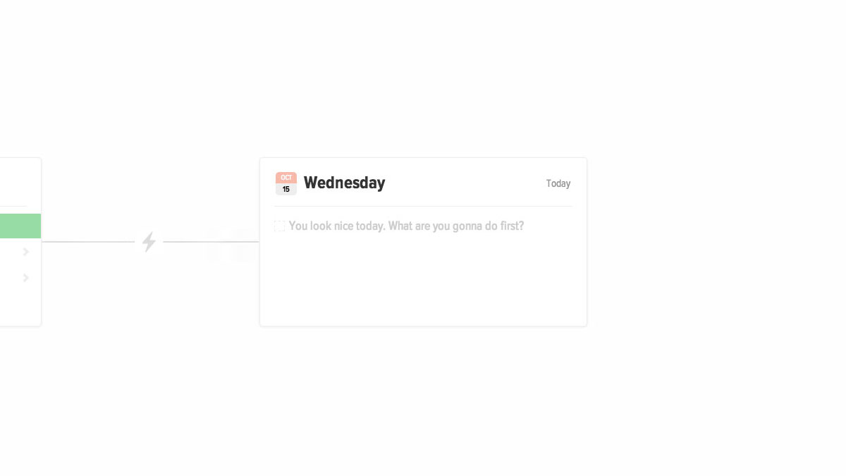
For welcome prompts, we used custom messages based on the time of day.
If it was morning: “It’s going to be a productive day. Enter your first goal.”
If it was late morning: “What can you get done before lunch?”
If it was past midnight: “Burning the midnight oil?”

In order to prevent too many tasks from piling up, and to help discourage users from entering very large tasks, the messaging changes depending on what they’ve entered. When prompting for more tasks, each message is different, depending on how many tasks they had entered and had completed.
Interactions
Delighters
Attention / Memory
We remember and respond favorably to small, unexpected and playful surprises.
Surprise
Attention
Our brains are stimulated by new and unexpected discoveries (within our normal routines).
Adding small delighters are vital to a great user experience; the details make a world of difference. Once we settled on the timeline concept, with each card connected by a piece of string, we took it even further by making the string elastic.
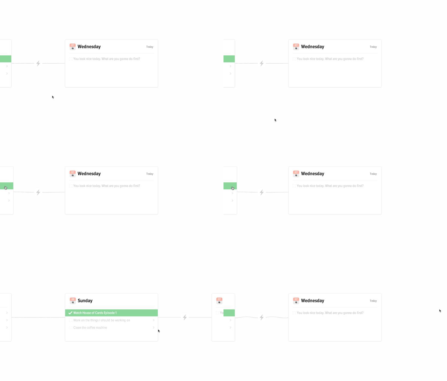
When moving between days, the cards snap into place and you can see the wave move down the string. When hovering over a card on the left or the right, the card peeks out, causing the string to droop.
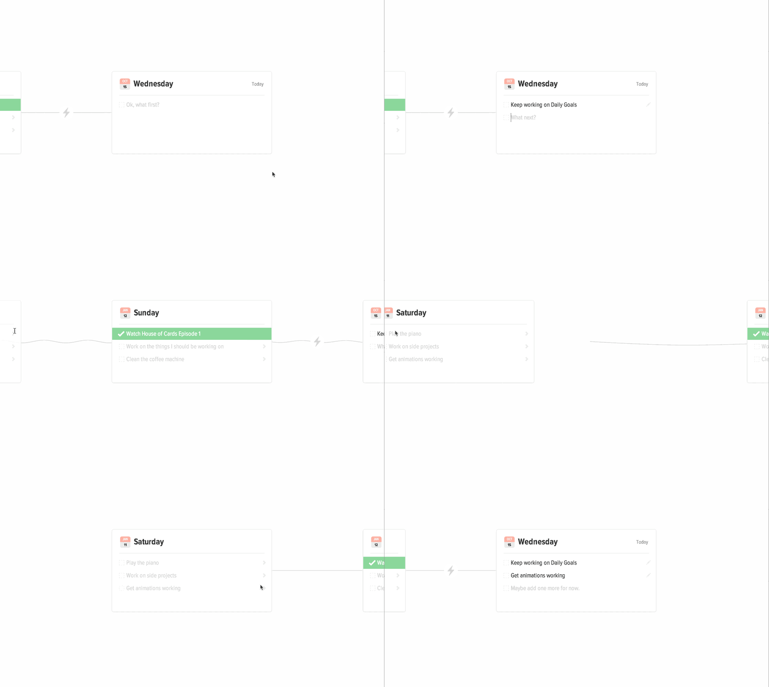
When moving an incomplete task from a previous day to Today, the task jumps off the page while the timeline shifts behind it.
Demo
Here’s a working demo you can look at it. There are definitely bugs, but the concepts are there.